
Recent years have seen the popularity of CSS layout modules such as Flexbox and CSS Grid. It is now possible to create complex layouts using both CSS hacks and JavaScript that were previously not possible.
The two CSS grids are similar and you can solve many layout problems using either one. However, when to use one over the other depends on the situation.
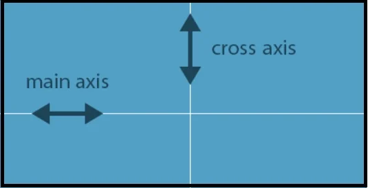
What you need to realize is that CSS Grid is two-dimensional, whereas flexbox is one-dimensional. Flexbox can lay out items horizontally or vertically, so you have to decide whether you want a vertical or horizontal layout.
In addition, flex layouts can be divided into multiple rows or columns, and flexbox treats each row or column as a separate entity, based on the content and the space available.
The CSS Grid, on the other hand, allows you to work along both horizontal and vertical axes. When you use Grid you can create two-dimensional designs in which grid items are placed into cells defined by rows and columns.
Flexbox allows us to create two-dimensional layouts (due to its wrapping capability) as well as one-dimensional layouts with CSS Grid (due to its auto-placement capability).
Although flexbox was not originally designed to create grids, it is frequently used in this manner. One of the best examples of flexbox is Bootstrap 4's grid system.
Almost every Bootstrap 4 website out there utilizes flexbox to achieve two-dimensional layouts containing rows and columns, and there are other popular tools that accomplish the same thing, such as Flexbox Grid.
USE CASES
Many people believe that Grid is for full-page layouts, while Flexbox is for smaller components. There is no truth to this at all. Picking the best layout requires assessing each one individually on a case-by-case basis.
Content Placement Using CSS Grids
Content placement is the focus of CSS Grid. It consists of both horizontal and vertical axes, with each item forming a grid cell. With CSS Grid, you can control the position of items within a layout with accuracy.
By using predictable sizing behaviors, authors can divide the space available for layout into columns and rows. Using the intersections of these columns and rows, the authors can then precisely position and size the elements of the application.
Flexbox has unpredictable behavior at certain viewports, and you can get unexpected results.
Defining the width and height of flexbox items and using calc() are both options, but then you eliminate flexbox's main appeal: flexibility.
CSS Grid differs from this. It has properties such as grid-template-rows and grid-template-columns as well as utilities such as fraction units that allow you to calculate everything precisely.
As a result, Grid is especially useful for arranging unusual layouts, like broken, asymmetric, and overlapping ones.
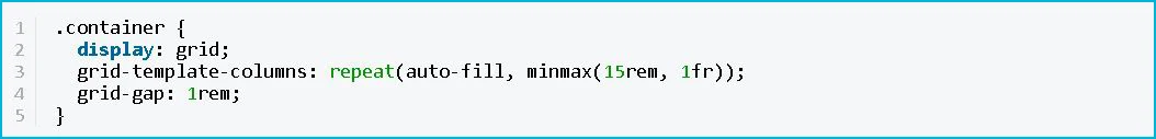
It is also possible to create responsive layouts without having to use media queries with CSS Grid.
This is how to make grid cells wrap and adapt to any viewport size:
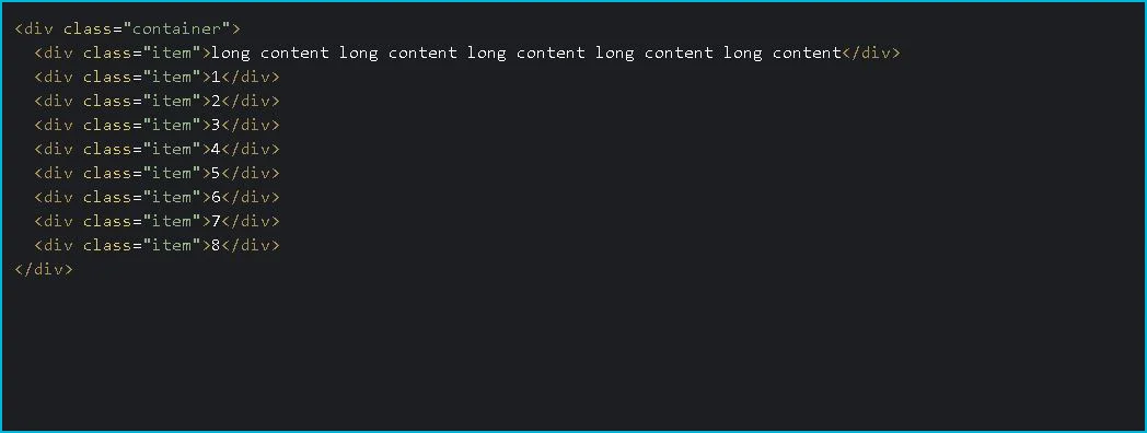
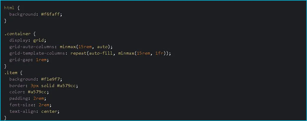
Even though the layout wraps using available space, the content inside the items is still not flexibly sized as the flexbox is:
HTML:
CSS:
Flexbox as the focus of content flow
Rather than focusing on content placement, Flexbox emphasizes content flow. Content determines the width (or height) of flex items. Depending on the space available and the content inside, flexible items grow or shrink.
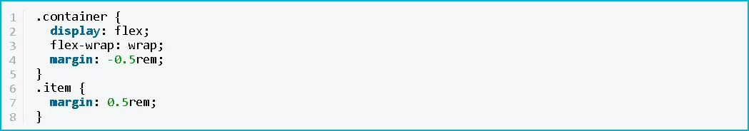
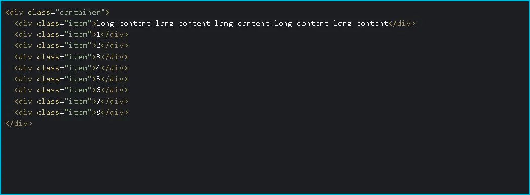
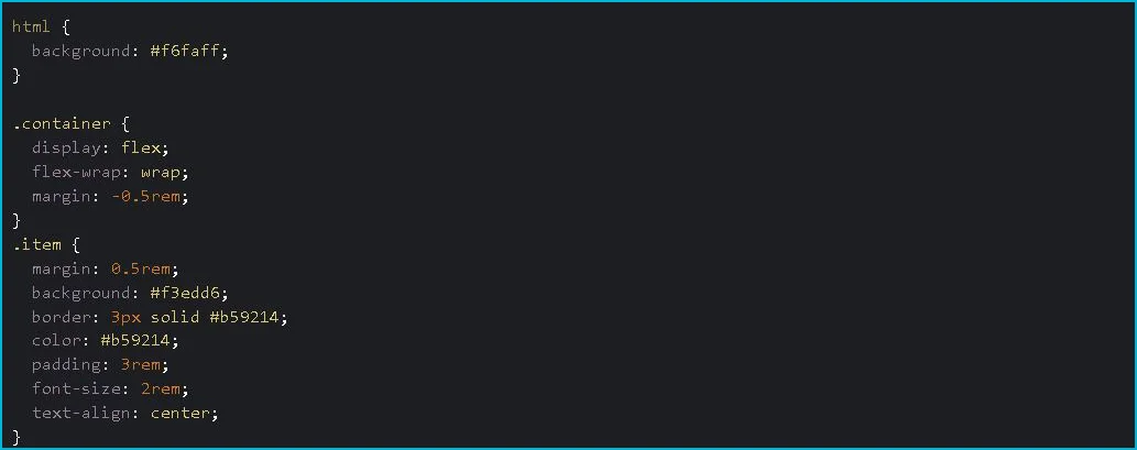
Take a look at this grid using Flexbox. Each flex item has a margin of 0.5rem added to it with the following code.
This is how the first flex item with the long content looks when stretched out:
HTML:
CSS:
It is possible to create fix-width flex items using the width or flex-base properties. If you do so, however, you lose the purpose of flexbox, namely its ability to understand the content.
The above image also shows how the flexbox treats each row independently. It is a one-dimensional layout with no columns and different rows aligning flex items based on how much text is inside of them.
Also, Flexbox lets you decide how your content behaves when the screen is too big or not big enough. Flexible items can be allocated effectively to every viewport size by using flex-grow and flex-shrink properties.
Browser Support
Flexbox has fairly good browser support, while CSS Grid is not supported
While many articles recommend using CSS Grid as a fallback, many developers prefer to use flexbox exclusively.
Flexbox doesn't work perfectly either - it has issues that are being addressed in the Flexbugs repo on GitHub.
Prepare for combat
In the flexbox vs. CSS Grid debate, there isn't a clear answer as it depends on a variety of factors.
It is a good idea to not stick with one or the other, but to think through which is optimal for your project. You can also use flexbox and CSS Grid together, for example, to create this cool card interface:
Work with world leading tech businesses
We connect high-performing software engineer talent in the Philippines with some of the world’s leading and most innovative Tech companies.
Submit CV
Author
